Orange - A Philosophy
The story of my danish orange mug led me to reflect on the impact of design and experience.
The Bold-Colour Cup I Had Been Eyeing
As you may know, coffee is one of my primary hobbies, so whenever I travel I try to explore as many cafes as my body allows. And along the way, I collect special or aesthetic coffee cups as souvenirs. Even before my trip, I have wanted a cup or a mug with a simple but bold design, and the April coffee mug was exactly what I was looking for.
Visiting The April Showroom Copenhagen
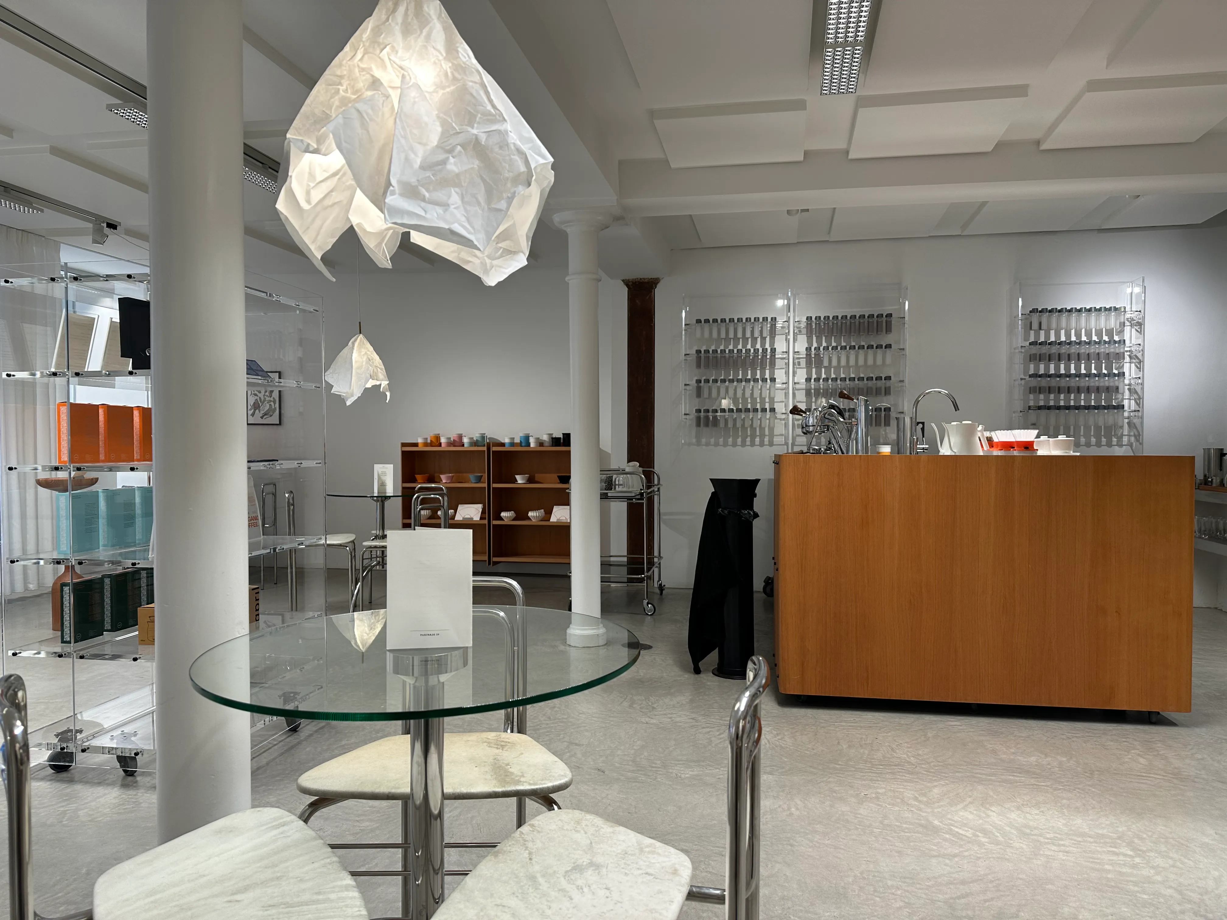
April is world-renowned for their high-quality coffee and premium experiences, so when I visited Copenhagen in May 2025, I made it a mission to visit their showroom. The cafe space is nothing less than meticulous, minimal in design, organized yet high tech to deliver a world-class coffee brewing and service experience.
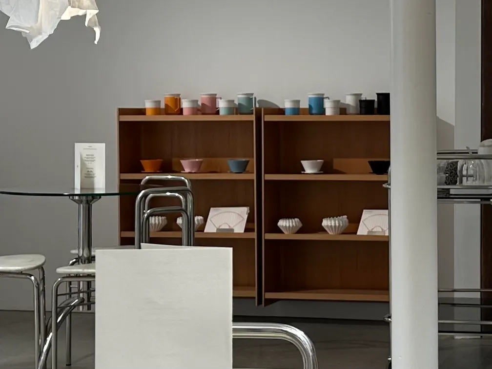
On the back shelf one can spot these beautifully coloured coffee cups, Danish design, so elegant. I had already mentally prepared to dish out the ridiculous prices just for one of these cups… Especially the orange one, the colour that April uses to represent their brand.
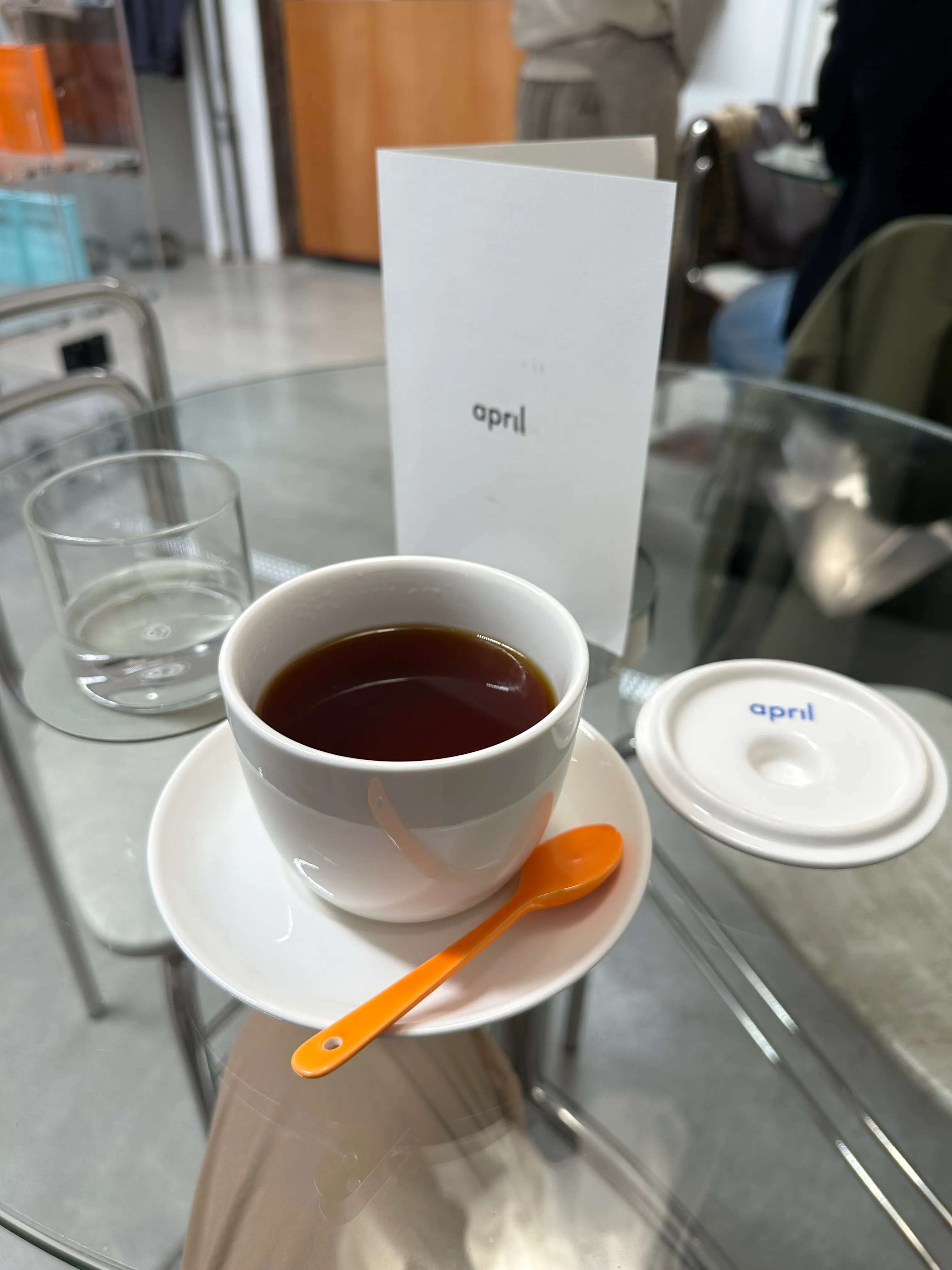
The service at the shop was fantastic. The staff were modest and attentive, almost too modest. So I placed my order, the baristas went to make the coffee behind their coffee bar island, and after a few minutes my pourover coffee was served. That was one of the best coffees on my trip.
Though I couldn’t help but feel that something felt off about my experience at the showroom, I enjoyed my coffee, but I walked out of the store later with a subtle sense of unease…
What is a Premium Coffee Experience?
April answers this question by putting the coffee in the spotlight, treating it with the utmost care. From the moment you enter the store, you are met with a scene of white: white walls, white chairs, transparent shelves, white lamps made of crumpled paper, accented by pops of colour of their various coloured coffee brewers and cups as well as the wooden coffee island. Where the usual coffee shop would have hoppers that store fresh coffee beans, April organizes their coffee beans in test tubes that line a wall, each pre-weighted and ready to be brewed. It’s a stylish laboratory.
The same amount of care goes into making your coffee, very methodical so each cup is just as consistent as the last, the same high-quality they expect to deliver.
In the background is calm lofi music that gives the space some dynamic, but the room is otherwise quiet.
I would describe the atmosphere as intense and focused. For each sip of coffee you take, it’s almost as if your other senses are numbed, such that all your focus goes onto the cup in front of you.
All this contrasts sharply with my usual coffee experience. Yes, taste matters, but coffee is simply the medium that delivers something larger. I see coffee as an art form that comes to life with the touch of several artists, from the farmers who cultivated the coffee cherry, to the coffee roaster, and lastly the barista that crafts my drink. Every bit of the way the artist in charge can enhance the expression of my cup of coffee however they see fit or feel. There is no perfect cup, because each cup is unique and tells the story of each person’s coffee journey.
At April, I feel as if there is an ideal expression of the coffee bean they choose to serve. They see a unique characteristic of the coffee variety that they want to share with the world, and so every cup should be the same such that anyone who comes for the experience gets a taste of April’s vision.
Orange
You eat with your eyes first.
Orange signals vibrance and excitement. It is associated with bright and sweet flavours, and subtle complexity.
I think this is why April chooses to use Orange to represent their brand, their coffees are exciting and represents joy, each cup should open your mind to new experiences.
However, I disagree with April’s execution of this artistic statement. To me, they nailed the taste department, but missing is the human connection, the passion, the warmth, and the story, all in favour of elevating the objective experience of their product.
Unfortunately, I found their store clinical and sterile, an atmosphere where a friendly conversation would feel disruptive, and a little pretentious. A feeling that a friendly conversation would disrupt the atmosphere. An expectation that the cup of coffee in front of me has a correct way of drinking, one that disallows their craft from existing in the context of my visit. I originally wanted to take home the orange April cup with me, but I realized that cup although still beautiful is tainted by an experience I found incompatible with what I thought Orange represents.
My Copenhagen is Orange
Copenhagen is quite an ordinary city, to a Torontonian like myself. It sits on landscapes that are uninspiring compared to other neighbouring cities. In fact, I thought the city was boring. Until one evening I was greeted by the setting sun at Reffen, and it followed me back to Nyhavn. It was beautiful sight that set the city into slow motion, tourists and locals alike taking a pause to breathe in the scenery, looking around and seeing faces in awe. That orange glow highlighted the architecture and community these Danes have built.
In my 5 days in Copenhagen, I rented a bike humourously named “El Embajador” from Donkey Republic, that took me through and around the city. Cycling in a new city is terrifying, but this experience showed me what an equitable city can look like, a city that feels good to live in regardless of which neighbourhood you live in, regardless of whether you have a car or not. A realization I made thorough cycling on this orange bike.
Also known for its design-rich history, artists in Copenhagen use orange to call attention to artwork. There are many examples such as The Orange Chair and Louis Poulsen’s PH 5 lamp.
Somehow all my favourite memories and things from Copenhagen happen to be orange. The colour orange has taken on new meaning for me, and now in my mind reminds me of my fantastic time in the city.
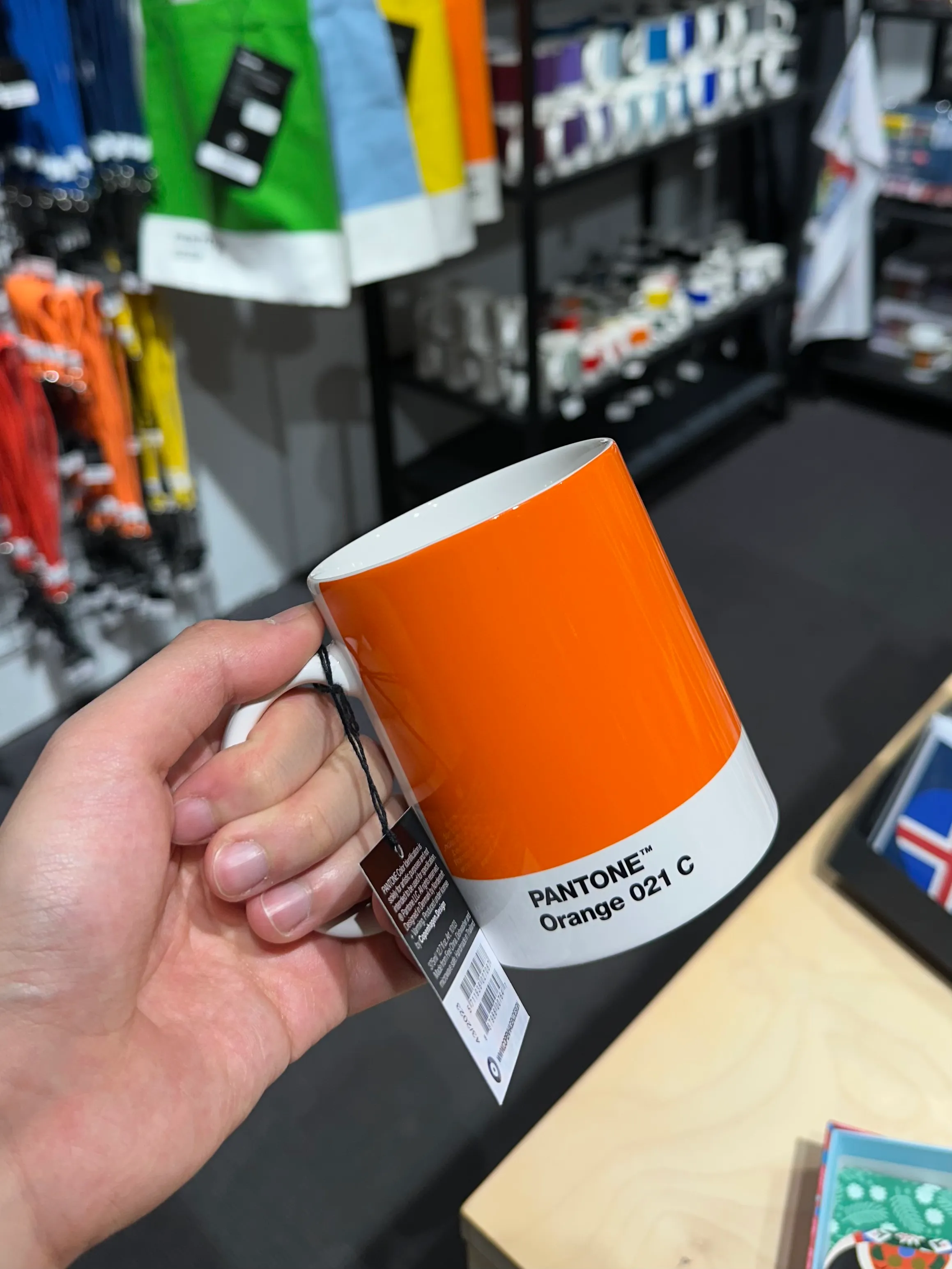
A new Orange Cup
I still haven’t abandoned my bucketlist item of an orange danish-design cup. Luckily, I came across one at a Danish design store, Illums Bolighus at Amagertorv. Designed by Copenhagen Design, this mug has a similar design language as the April counterpart. The design isn’t as sleek, but as a daily cup, its larger volume and handle is way more functional. Better yet? It’s a third cheaper!! smiley face double thumbs up :D
So that’s the one I got.
Now not only is orange aesthetic. It has taken on a meaning that represents my time in Copenhagen, and this fascinating story about my reflection on a special cup of coffee, and not just a colour.
Orange is a bold statement, first catching your attention then letting the object speak for itself. It sticks out because it is different from others, and used with intent.
Just like Orange, I want my blogs and projects to challenge tradition, with the goal to reach others with opinions to explore thoughts and innovate in design, ultimately bringing positive change to things we thought could not get better.